Validate
Usability Test Goals
Rate the learnability of the app and asses the MVP features presented through scenario tasks.
User Test Objectives
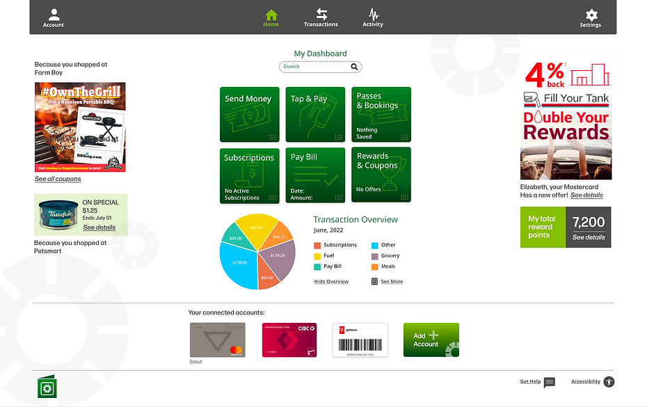
1. Evaluate if participants can navigate the landing page and understand what type of app Vault is.
2. Determine how well participants navigate the app and input specific data that would be used in the course of a task.
3. Can participants easily find other app function entry points?
Methodology
This study was performed in person and as a moderated remote session on the agreed-upon date and times selected by the participants.
Participants & Schedule
This study will test 6-10 participants recruited through email and phone conversations that align with the Vault user persona.
Usability Test Report

Issue 1
(HIGH): Differentiate between transaction notifications and messages on the activity screen
Solution:
Show separate dates for alerts and messages. Visually separate on 2 lines.
Observation:
Testers struggled to differentiate between transaction notifications and messages. This is a problem because notifications and messages will sometimes be shown for the same transaction.

Issue 2
(HIGH): Difficulty swiping to select reward and payment cards.
Solution:
Re-create swipe effect for card carousel.
Observation:
This was a prototype bug and not a design problem. Testers knew what they wanted to do when asked to complete the task but the prototype was not functioning as it should.

Issue 3
(HIGH): Testers had difficulty sending transaction messages.
Solution:
Simplify the task of sending a message within one workflow.
Observation:
This was a problem for the user because there were two separate task flows for sending a message. With and without a transaction and this made it confusing for testers.

Issue 4
(HIGH): Reduce clicks to access the
often used screen.
Solution:
Move activity link to main nav. for quick access to the screen that is used often for task completions.
Observation:
This was not a user complaint but an observation I made during user testing sessions.

Issue 5
(MEDIUM): Sorting activity is confusing.
Solution:
Remove sorting function on activity screen, not beneficial to the user.
Observation:
The activity screen was getting cluttered and users that did see the sorting text thought they were headers for the activity list.

Issue 6
(MEDIUM): Testers were expecting to see data on their home/dashboard screen.
Solution:
Add a graphic transaction summary chart to a dashboard.
Observation:
The user mentioned that a dashboard typically has some sort of overview and this led to the understanding that most users would like a categorized transaction summary that could be configured.

